
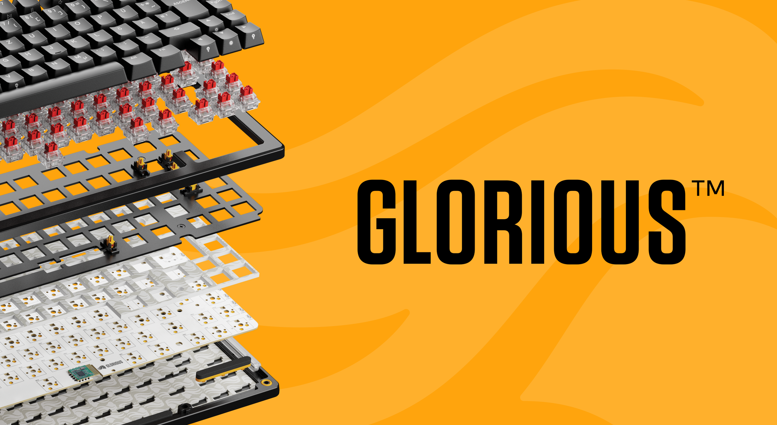
Glorious Gaming
in-house work, glorious gaming - 2021-2024
Overview
My Contributions
Packaging Design
Retail Design
Production Artwork
Keycap Design
Glorious Gaming is a PC gaming peripheral company based out of Dallas, Texas. I worked with them as an in-house packaging and retail designer for 3 years, my work spanning most print design work (including supplementary materials) to the occasional delve into product design.
The mission of Glorious is to bring premium, high quality products back to gamers, without compromising on customizability. The focus of my position was to help push the established brand standards of a previously e-commerce focused brand into a physical retail presence.
Most of our main-line retail packaging utilized UV spot gloss, as well as heat press holographic foil to emphasize products with limited color illustrations.
Perhaps the easiest way to categorize this work is into five categories. Keyboards, mice, accessories, retail displays, products, and manuals.
keyboards | mice | accessories | retail displays | products | manuals | flat lays
keyboards
I had the opportunity to work alongside the Glorious team to create the packaging for the GMMK 2, the GMMK PRO Prebuilt, and the full product line of the GMMK 3. My role in these releases (aside from creating production ready artwork) was to help translate overarching creative direction into design that could hold required information, and massage details so that they could scale across product variations ( size, color, localization ). I also created most of the front, side, and back panel vector artwork until creative direction moved to renders.

GMMK 2 65% in pink. I helped prepare production files for most SKUs, of which there were dozens. Two sizes, three colors, and up to seven languages depending on variant. I also helped make the decision to depict color on the front of the product, as previous products limited color to the badge only.
Image Credit


GMMK 2 100% in black.
Image Credit


GMMK PRO 75% Prebuilt variant. This SKU was a French language adaptation to be sold in French physical retailers.


GMMK 3 PRO HE Wireless 75% Prebuilt Black in German language. One of approximately 90+ variants for the GMMK 3 release, this was one of the localized variants created for physical retailers. At this point the brand had shifted towards colorful renders to put more emphasis on the product, with a subtle metallic finish for backgrounds as opposed to the holographic foil previously used.

mice
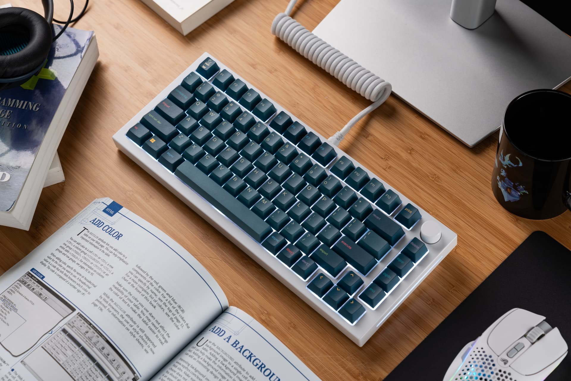
While I had the opportunity to work on most of the mice releases in the 3 years I worked with Glorious, the release of the V2 main line mice (Model O2, Model I2, etc.) and the first main line release of the PRO model mice is where I feel my work was the most impactful, as I created product illustrations for top view, side profiles, and helped organize product information. In the case of the PRO mice, helping push for the use of full color renders to differentiate them as a more premium product versus the illustration based packaging of other mice.

Model O 2 Wired in white.
Image Credit


Model O 2 Wireless in black. Spot gloss and a dark color scheme were used to immediately differentiate wired and wireless variants.
Image Credit


Model D 2 PRO 4K8KHz, where the switch to full color renders on the front of products was really finalized. Rather than holographic foil, the front render was given a coating of spot gloss.

accessories
Accessories make up the bulk of the Glorious catalog by volume. These were actually some of the more fun to work on, and more challenging products as the amount of information, and amount of space given per product were much more varied and still needed to scale. This is just a small sampling of some of the products I helped package.

GS2 Stabilizers, an update to previous stabilizers.
Image Credit

Switch springs, of which I was able to help determine the packaging and labeling system. Each weight is assigned a color and an interchangeable sticker is used allowing for more versatility among a niche accessory.

Glorious Raptor switches, one of the more unique accessories specific to mechanical keyboards, they're what make a keyboard work.


Polychroma RGB Keycaps, part of the rollout with the GMMK 3 release was a redux of the keycap packaging to better align with the new keyboard packaging. I was responsible for the rework of presentation to align with newer brand standards, as well as the information present and how it was presented on the package.

retail displays
Though a lesser part of my responsibilities, I was given the opportunity to create physical retail displays for our products. Displays had an individual approach for different retailers, especially within the US.

My first time working with retail displays, this display is present within MicroCenter and was a showcase of the customizability of the GMMK Pro platform.
Image Credit

A much wider spread of products, this retail display was the result of collaboration between myself and my at the time creative director, Sarah Utz. I designed the right side section with interactive elements, and started laying out the placement of the products on the bottom left panel.
Image Credit
products
Part of the reason I made a good fit on the Glorious team was my previous freelance experience within the keyboard hobby, and my time with that creating production art for keycaps. While at Glorious, I was lucky enough to get the chance to design two different keycap sets. One set went to main-line retail, the other set was part of the Key-Capsules limited edition series.
At times I was also responsible for creating production artwork for serial stickers, keycap layouts, and the silkscreen of logos on mice.

GPBT Grapefruit is the main-line retail keycap set I had the opportunity to design. I selected the colors and accents and prepared production artwork.
Image Credit

GPBT Code Brew was the limited edition keycap set. This was based on a combination of Java Script, and a terminal color scheme. It was made with a much more niche audience in mind, and I had the chance to add a bit of flair with a coffee mug novelty.
Image Credit

manuals
One of the processes I was intimately involved with was the creation of ‘quick start guides’ that were packaged with electronics. These gave basic quick start info, storage information, as well as legal information.
I would typeset these to match brand standards at the time, and was responsible for working with our at the time packaging engineer to determine size and fold lines for these documents. These documents were typeset in Adobe inDesign, and when necessary, flattened in Adobe Illustrator.
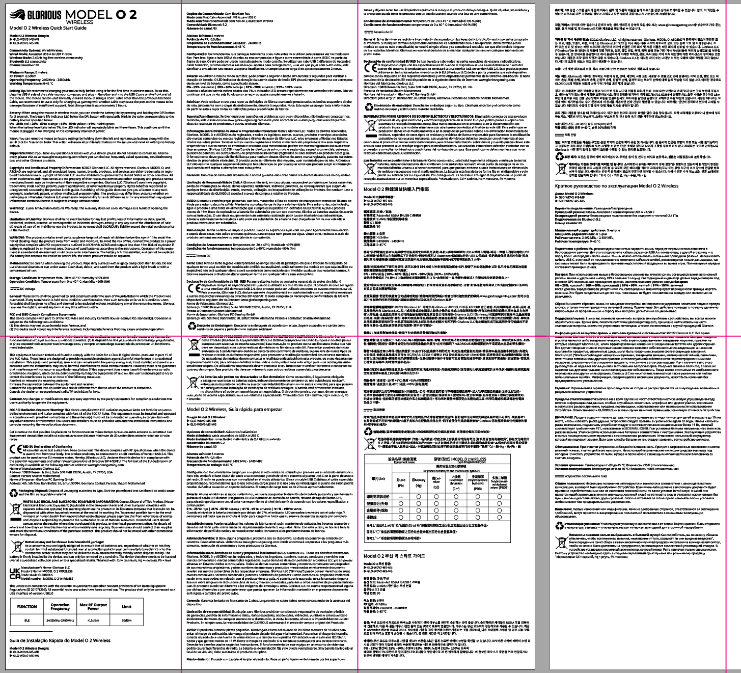
A wide shot, showcasing one side of a fold out quick start guide. The pink guides are to indicate fold lines. This was for a wireless mouse, and required the placement of copy pertaining to wireless certification and the like, as well as the materials table.
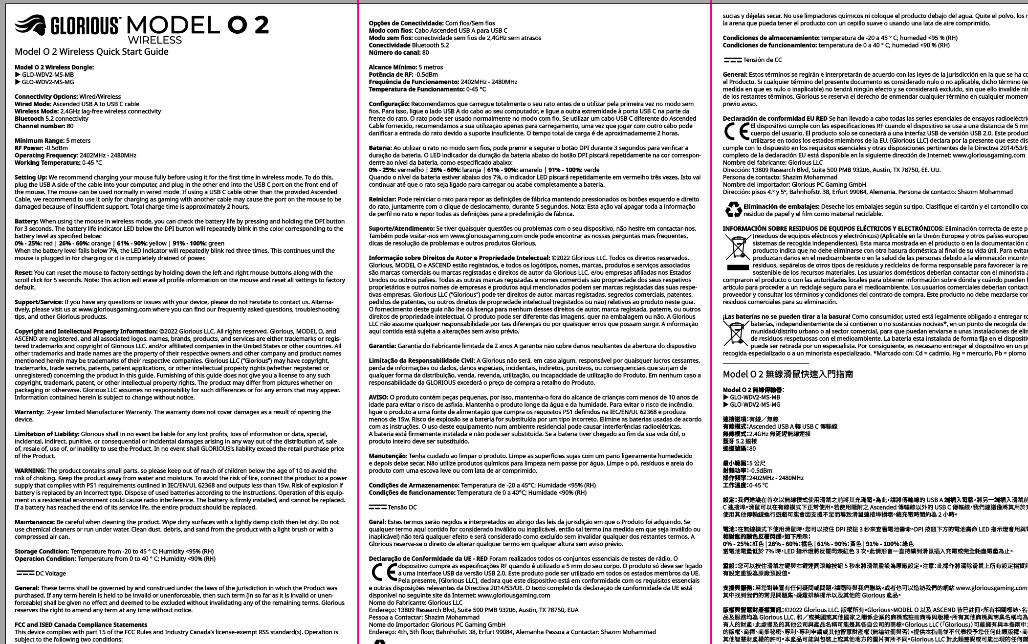
A zoom in of the previous image, giving a closer look at the typesetting. These manuals were in multiple languages.

With the GMMK 3 release we were able to make the move to staple bound manuals that made for better user experience and legibility. These are spreads from the GMMK 3 PRO HE 100% manual.

Continued from previous image.
flat lays
One of the biggest responsibilities I had as a packaging designer was also creating the production art necessary to make things a printed reality. I was responsible for managing the CMYK color space, making sure Pantone swatches were used properly and labelled properly, and making sure that designs were within proper print spec.
Optimizing for print, as well as working with our packaging engineer to confirm these optimizations was one of my favorite parts of working at Glorious. Below are several samples of production artwork within die lines.

Production artwork for the switch puller accessory, created prior to the most recent rebrand.

Production artwork for the Glorious Raptor Switches, created prior to the most recent rebrand.

Production artwork for the switch springs accessory, created prior to the most recent rebrand. Included as well is the sticker that would indicate weighting on the front of the package. The back barcode, SKU, and required certifications were on a separate sticker to optimize for the multiple variants of this short run product.

Production artwork for the outer box of the French Language GPBT Celestial Ice Keycaps.

Production artwork for the outer box of the GMMK 3 PRO Barebones in silver.

Production artwork for the GMP 2 mousepad in Rainforest colorway.