Transformers
Generations
speculative design, personal work - 2026
Overview
My Contributions
Packaging Design
Production Artwork
Art Direction
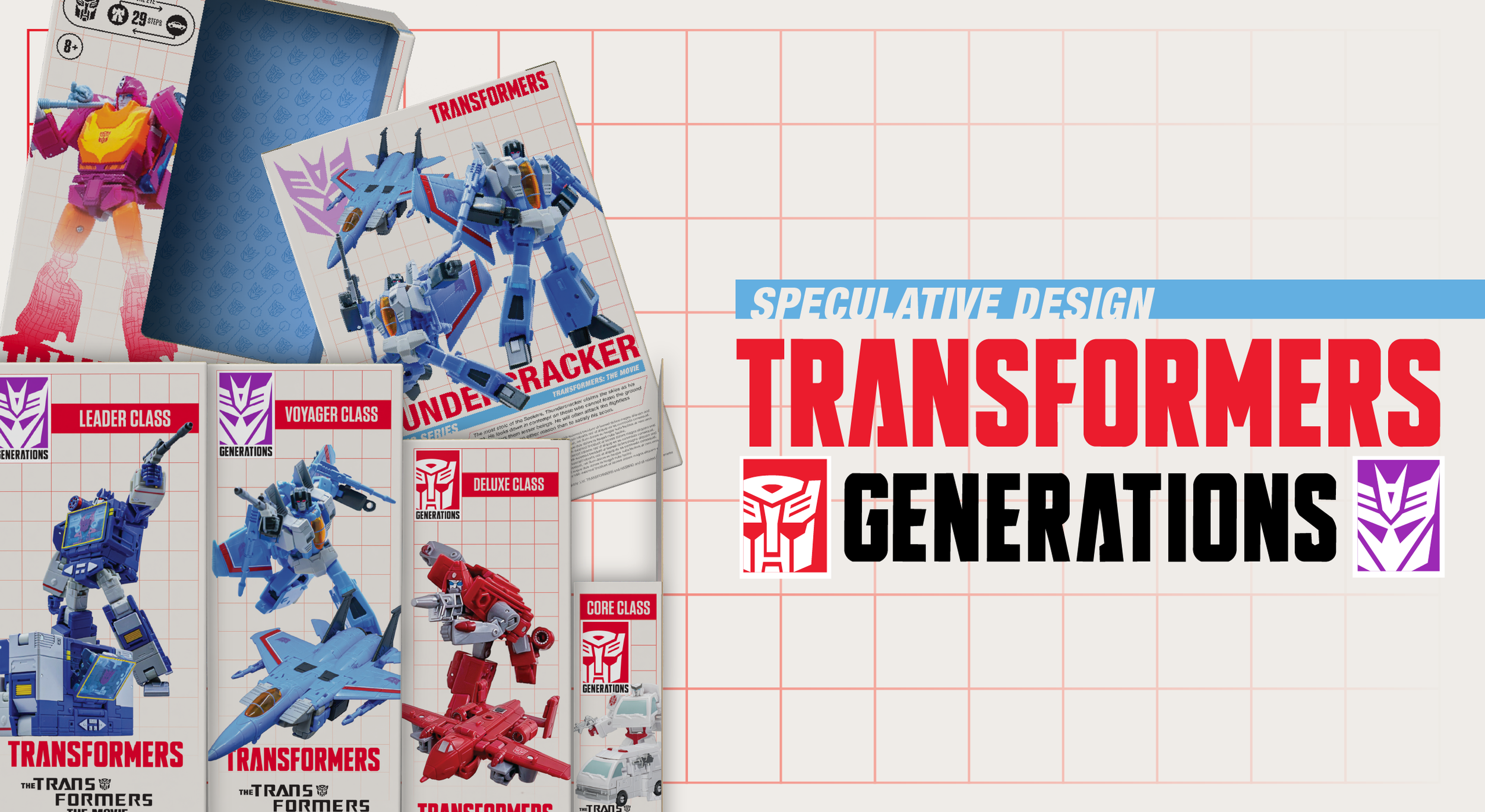
A speculative redesign of the Transformers Generations product line packaging, it included a new art direction that could be adapted for socials, retail placement, and if expansion were desired, the potential for use on other products.
A big part of this was my love for the series, and the toys themselves, as well as a desire to really flex the muscle of how this system could be approached.
The priorities for this redesign were to shift the focus- the Generations line is a more expensive product line, focused more on screen accuracy and articulation. With the price point, and the more obscure cast compared to play oriented product lines, I wanted to chase an older audience, and in my eyes that meant a more distinct look, as well as more clear labeling.
Art Direction
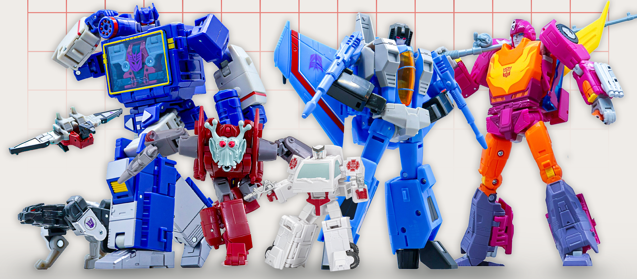
Half of this was preference, half of this was need to be distinct. A current problem I found with current packaging was the artwork. It’s beautiful artwork that shows the character well, and puts the personality front and center, but I found that it is less product oriented and sells the idea of the character separate from the product in hand. In that sense, I shifted the packaging to be more photography focused, with photos of the toys in ways that sold the idea of the character, as well as possibility of play and display. I was lucky enough to speak with @tftoy_pics on Instagram, and was given permission to use his photography for the project.
The decision to use an off white with a grid background went hand in hand with the want to shift focus to the product itself. The use of the grid alluded more to the robotic, almost digital in nature idea of the Transformers themselves, and the off white background gave a better canvas to display the photography on. On matters of personal taste, I felt it also harkened back to a more true representation the 80’s in terms of design ( think PC accessories and the like. )
I used two font families for this redesign. Helvetica Neue, and Tungsten. Helvetica for body copy and captions as it’s a fantastic Sans Serif for legibility across multiple sizes, and I really enjoy how angular the letterforms feel in comparison to more commonly used Sans Serifs. Tungsten is used for name, allegiance, and size callouts- a much more condensed typeface that is very rectangular in nature and matched the energy of these enemy factions and the names they held. It also had enough weights to accommodate the differing lengths in character names. ( Ratchet vs Thundercracker, as an example )
Design
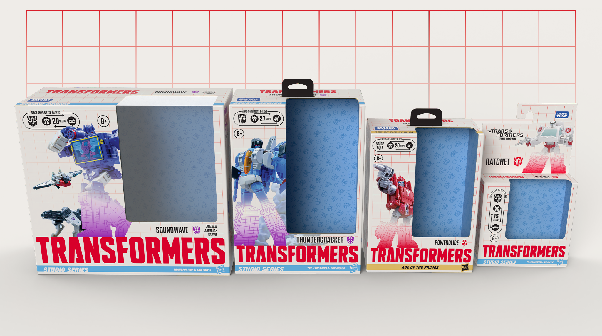
Below are galleries for each size class I did designs for, ascending in size to illustrate changes across the format. Differences in size class, alt-mode, amount of characters included, sub-line, and faction where what I wanted to illustrate with the toys I chose to depict below.
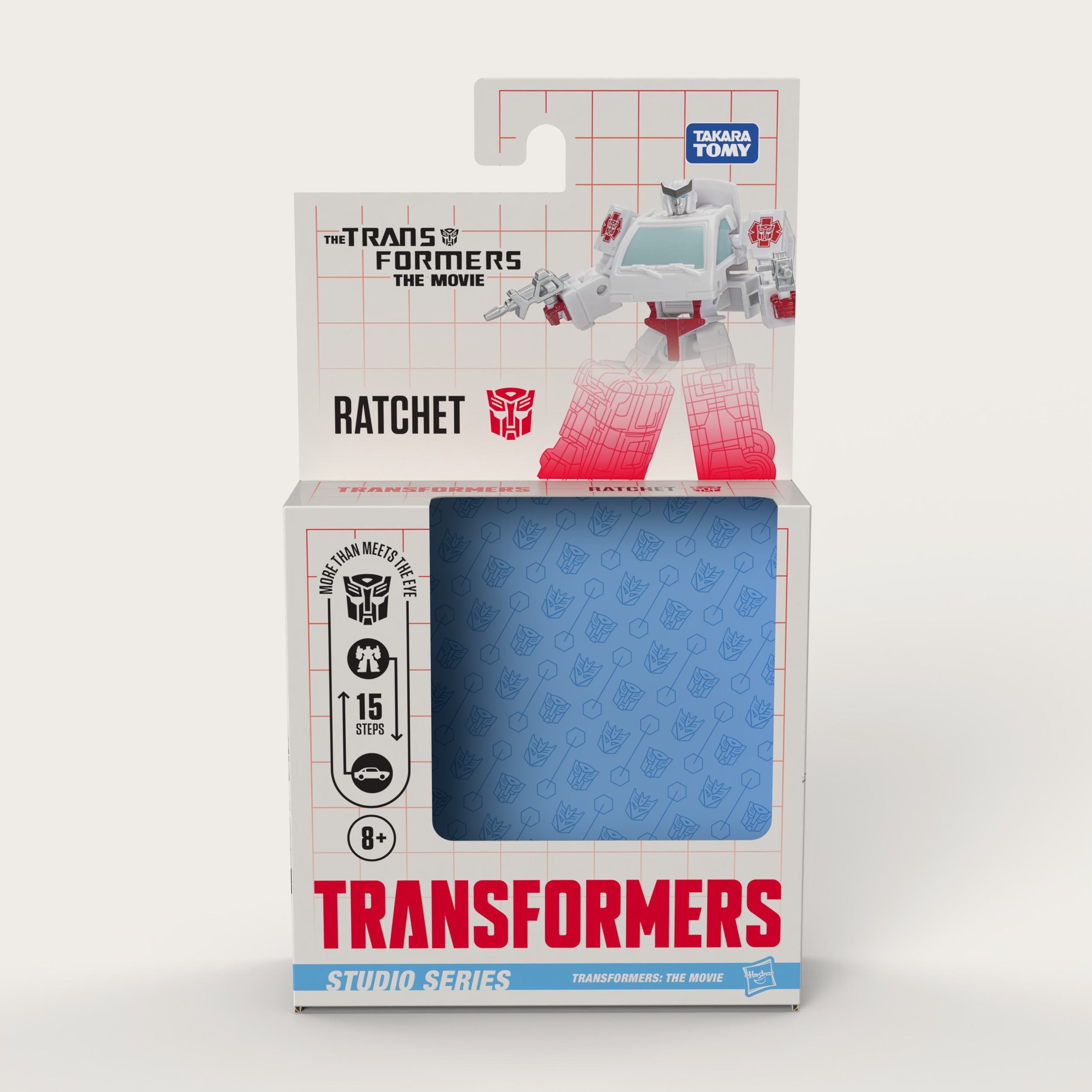
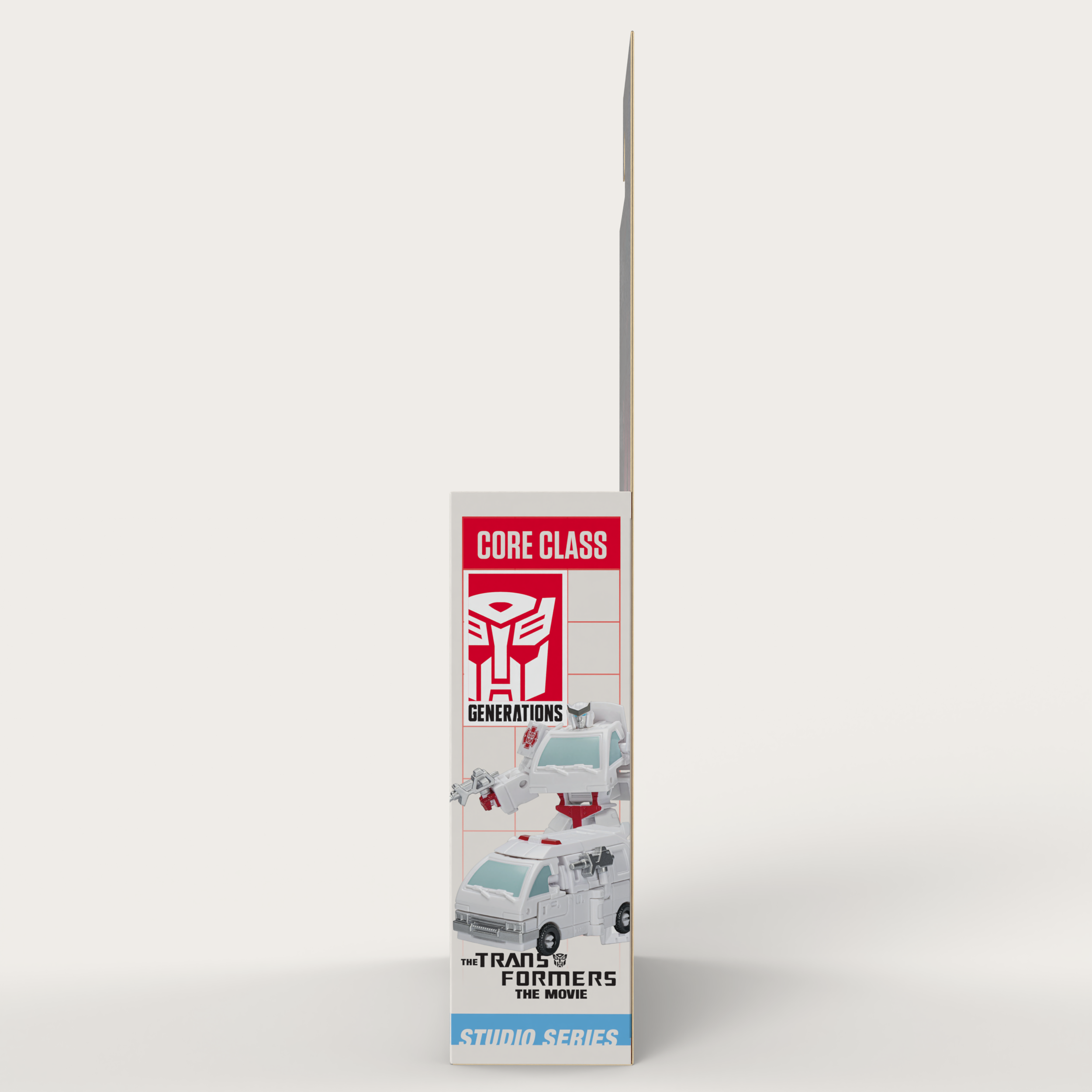
The Core Class size- the smallest and least expensive of the available toys. Space is at a premium, but by utilizing existing dielines that utilize an integrated card hangtag, it's able to block more effectively than a traditional box.
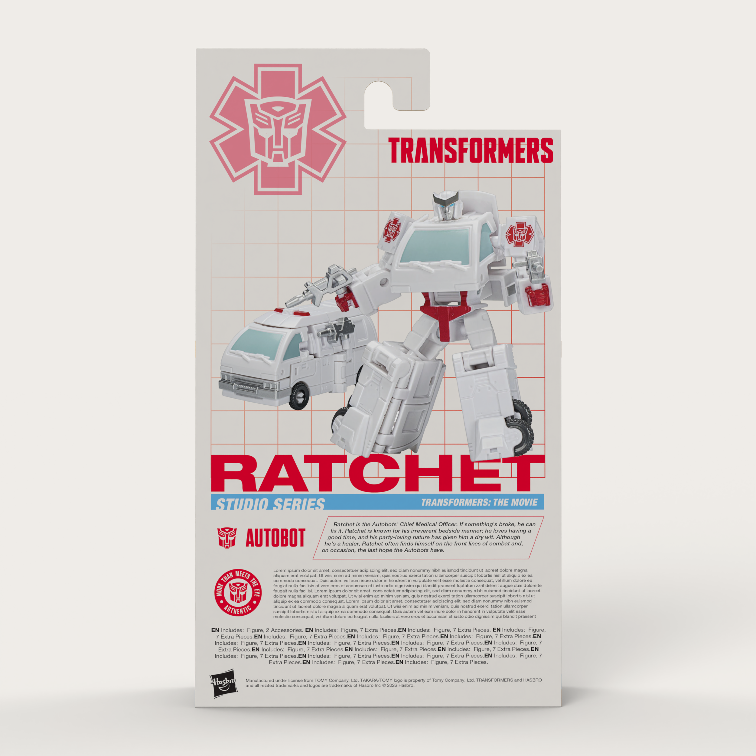
The back panel for this used the medic version of the Autobot symbol, depicted on the toy itself. In this case, I felt it added more visual emphasis on what character this was, as there is a very similar Ironhide Core Class that shares most of this mold.
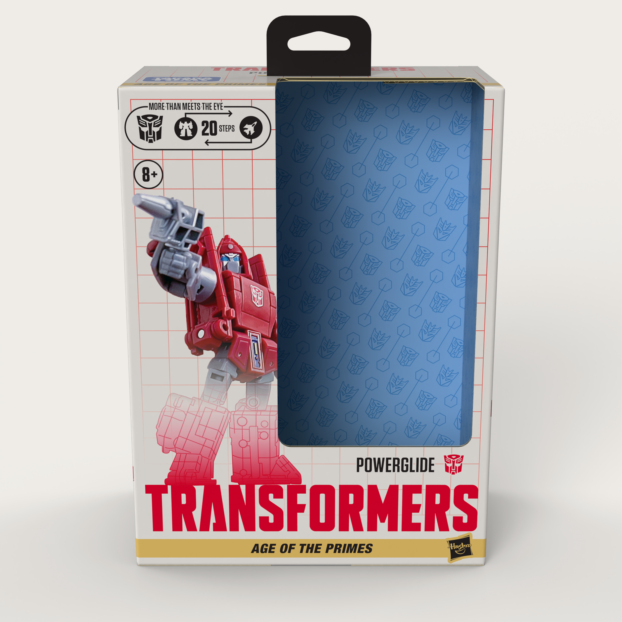
The Deluxe Class size- probably the most varied and versatile size in the product line. This also showcases how the different series releases can be shown on all sides, with the Age of the Primes ribbon immediately indicating which lineup this is a part of.
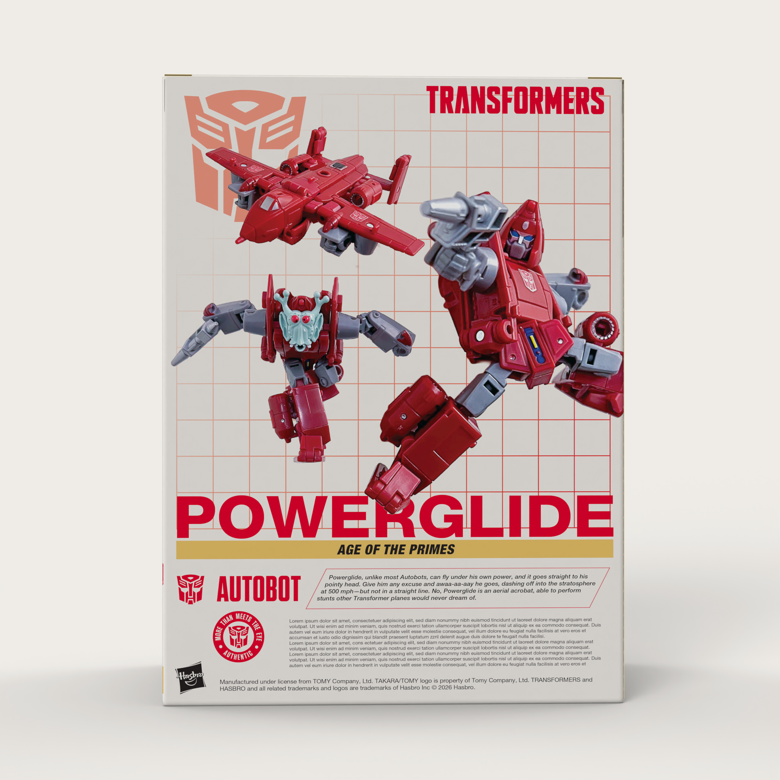
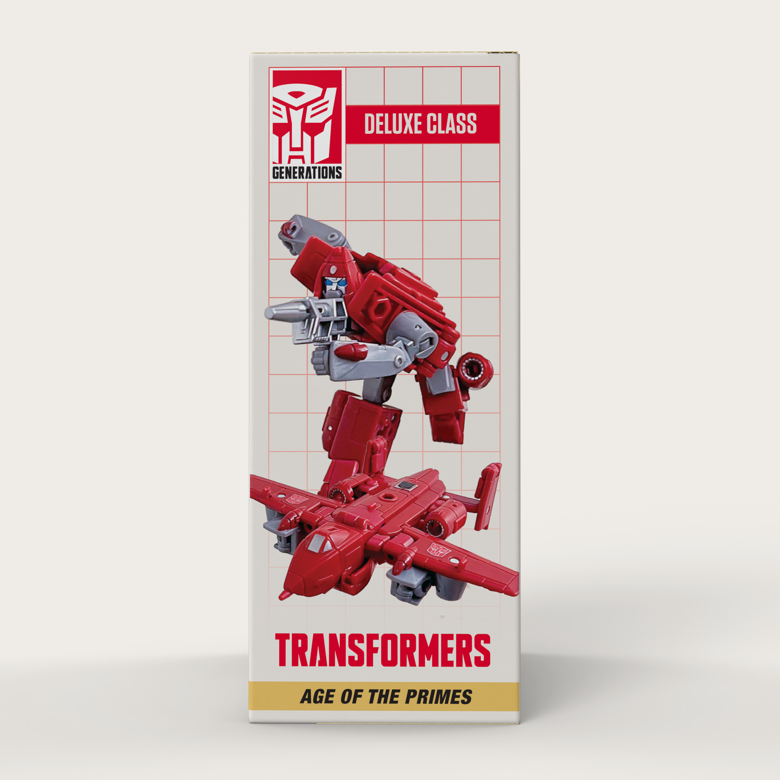
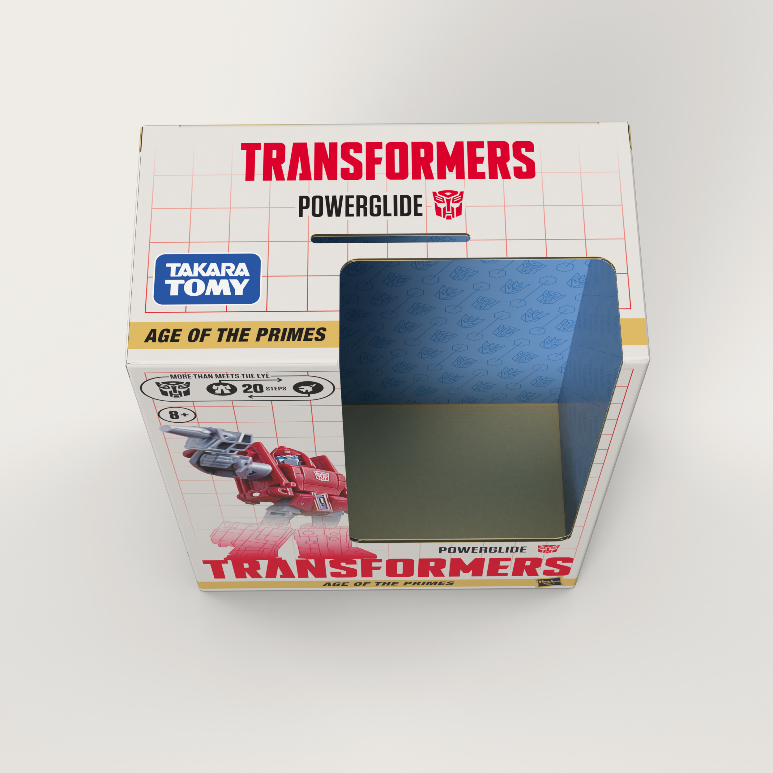
The Deluxe Class size also introduced the use of a separate card hang tag, while leaving out the acetate window to increase recyclability and removing that from production cost.
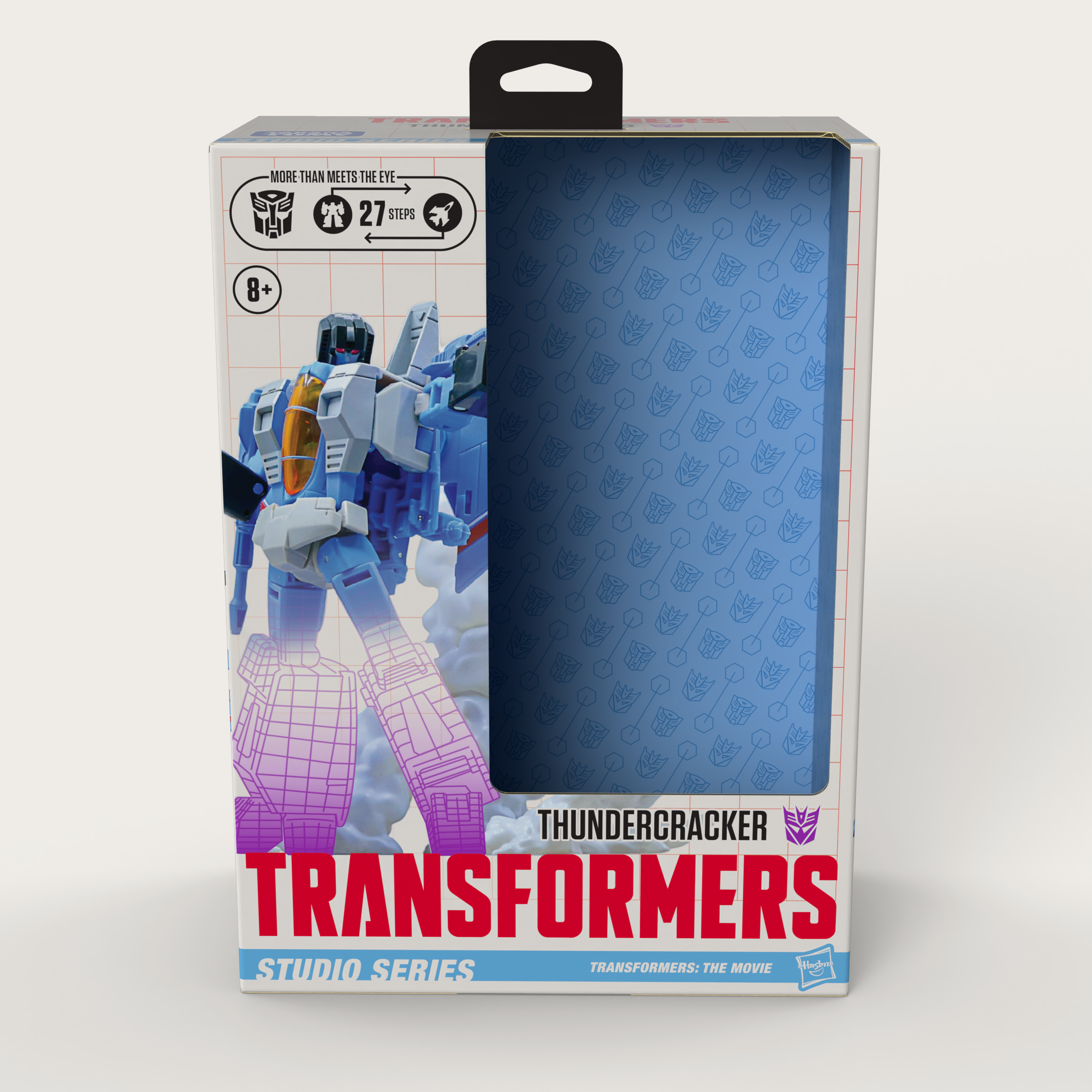
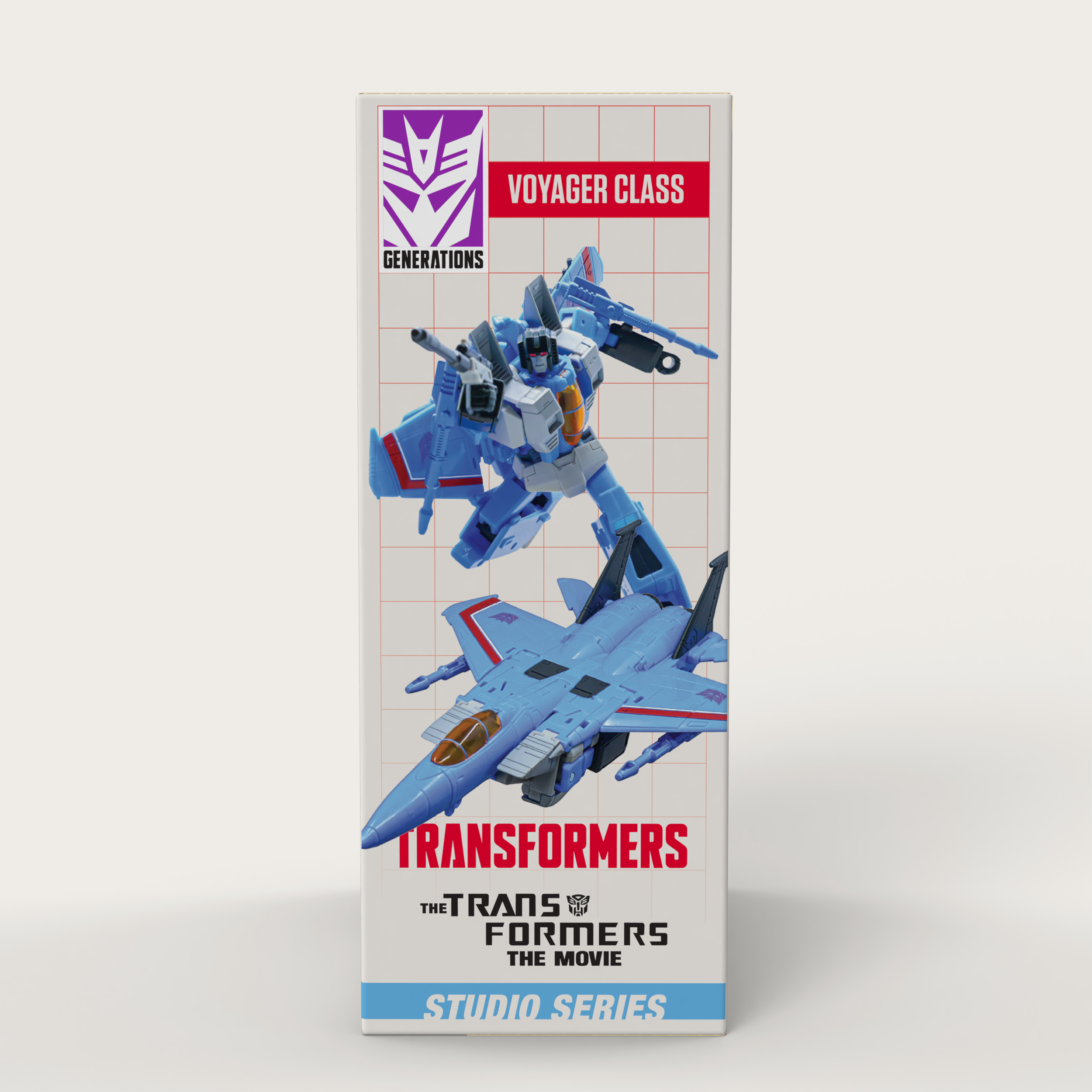
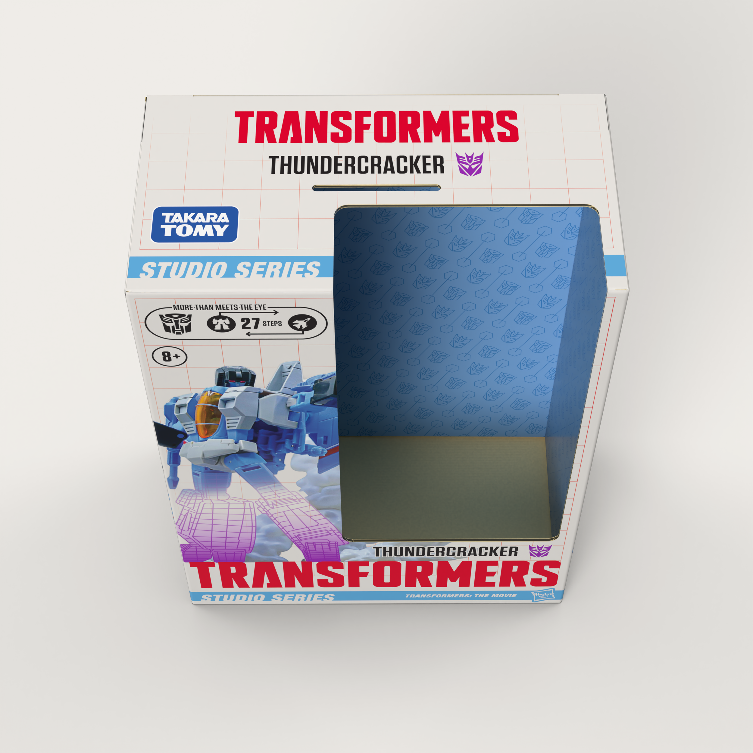
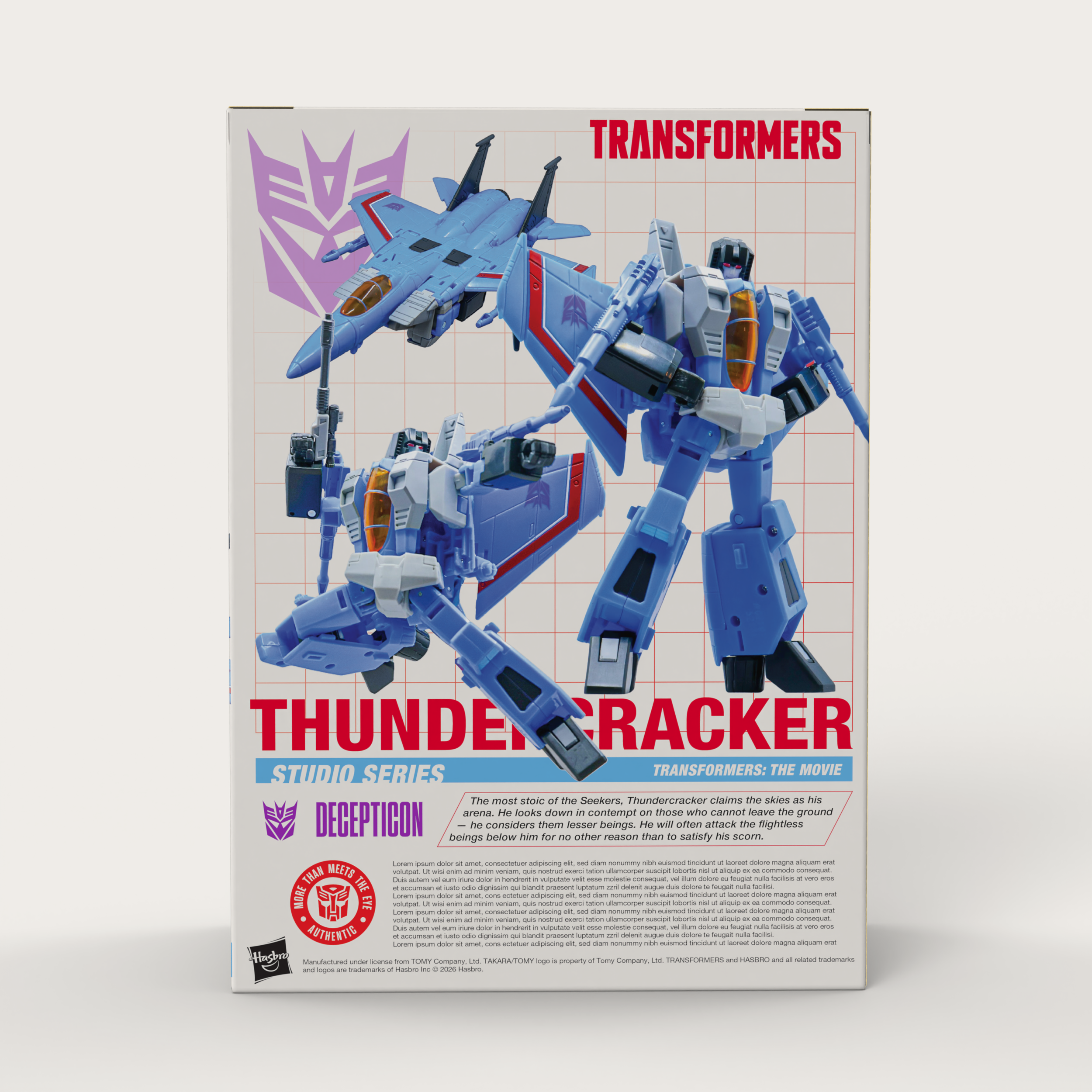
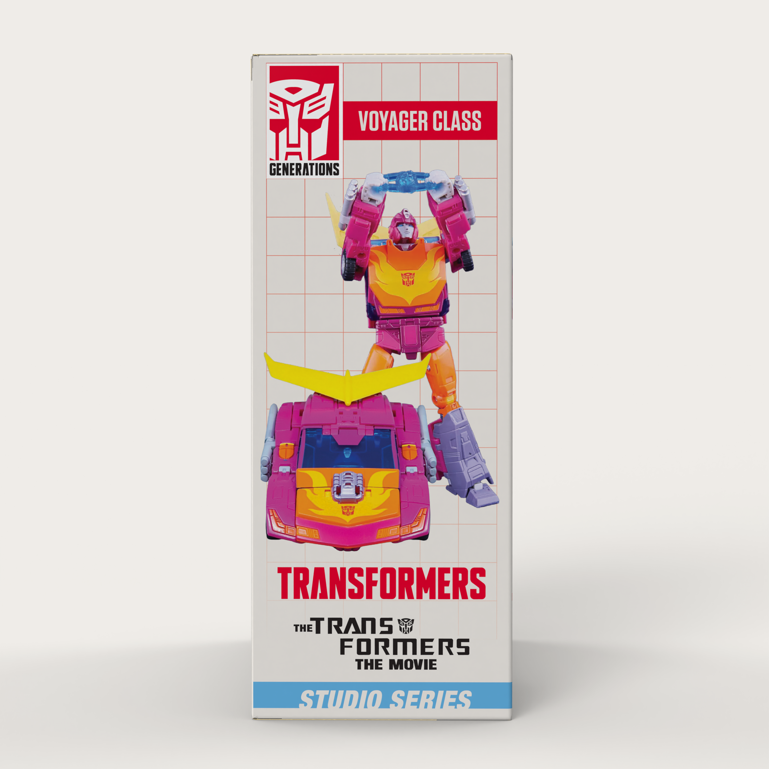
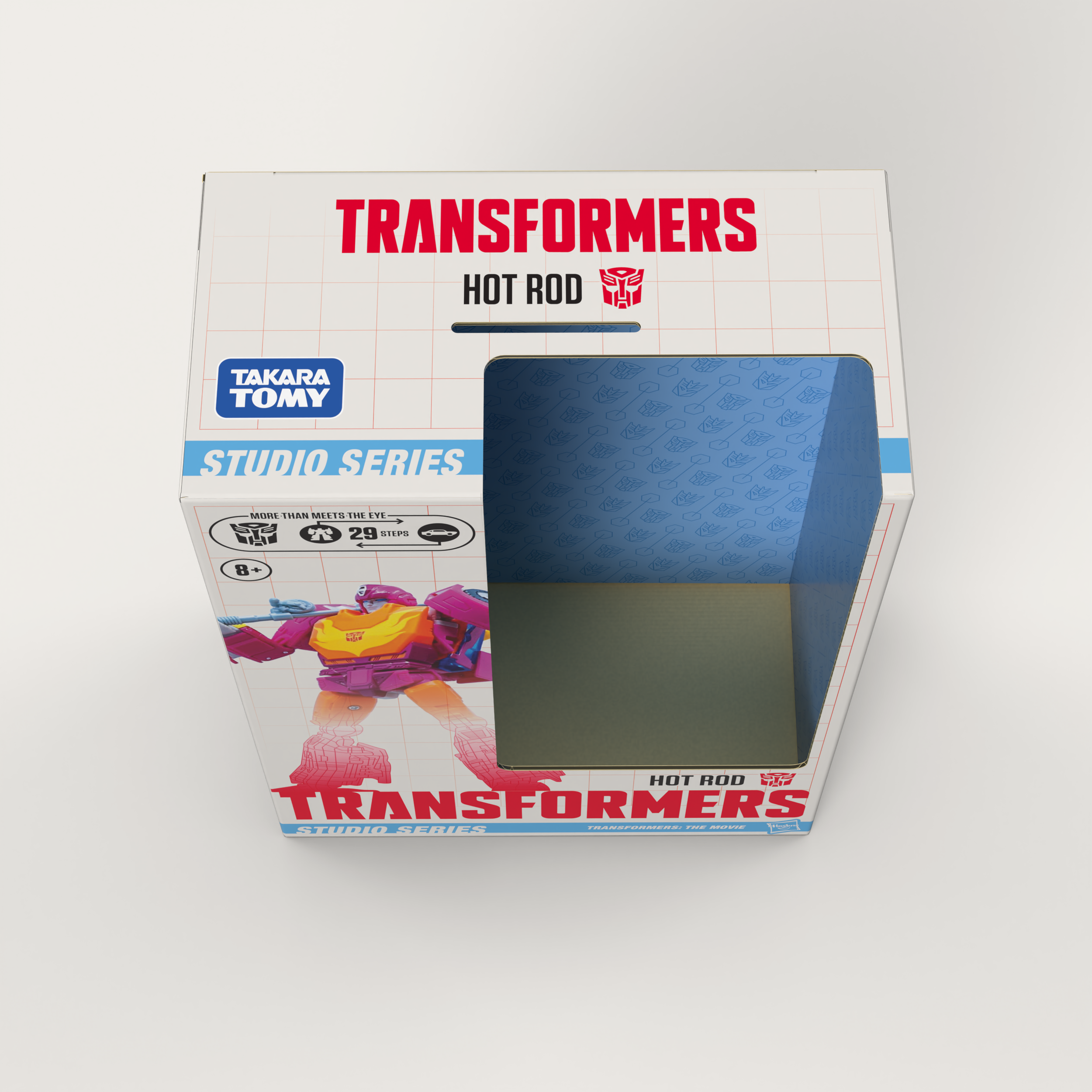
The Voyager Class size- in my opinion the flagship size. Higher price, better articulation, and a bit more space on the packaging to display these beautiful photos and logos. This package also shows how I chose to differentiate factions on sight- the use of that beautiful Decepticon Purple on each panel.
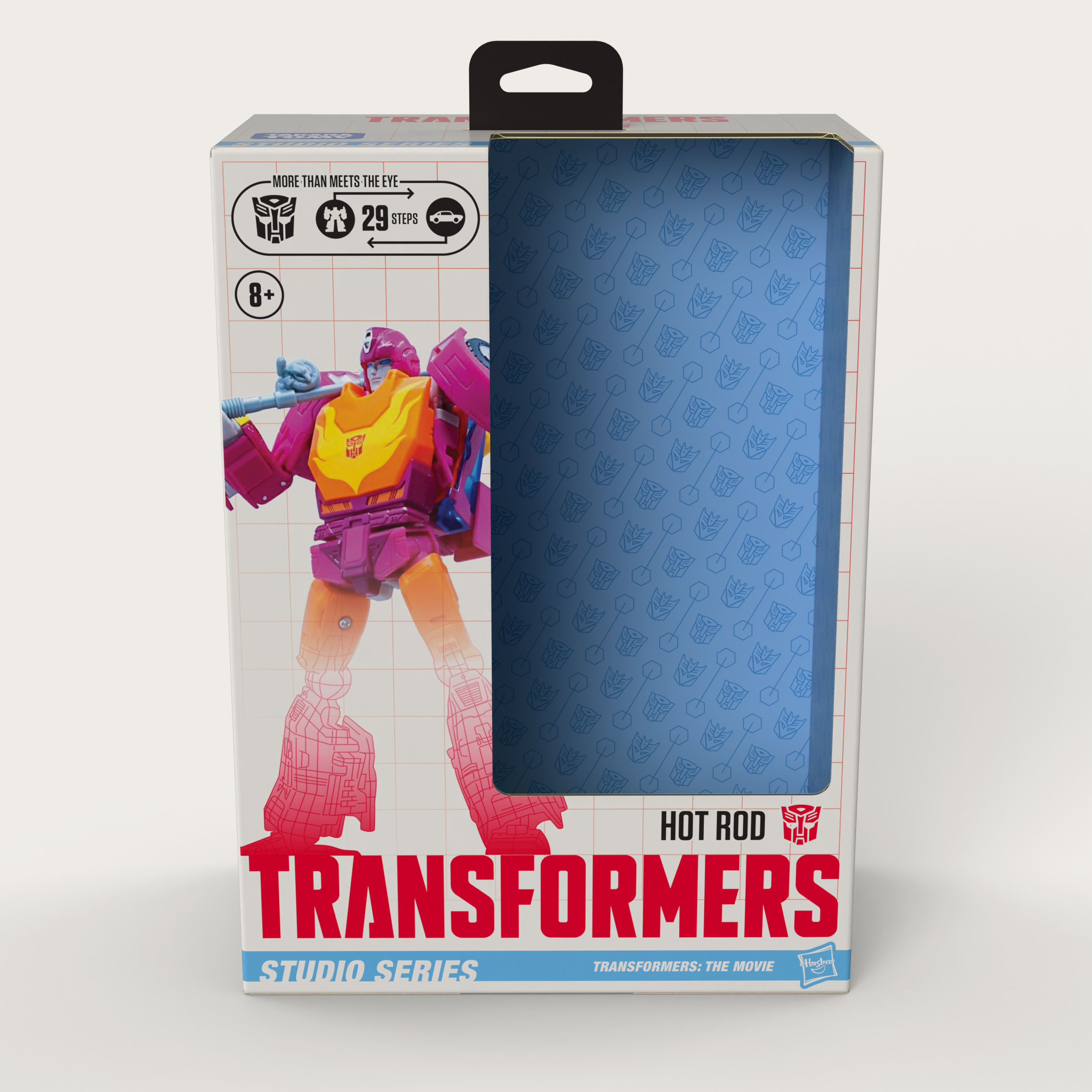
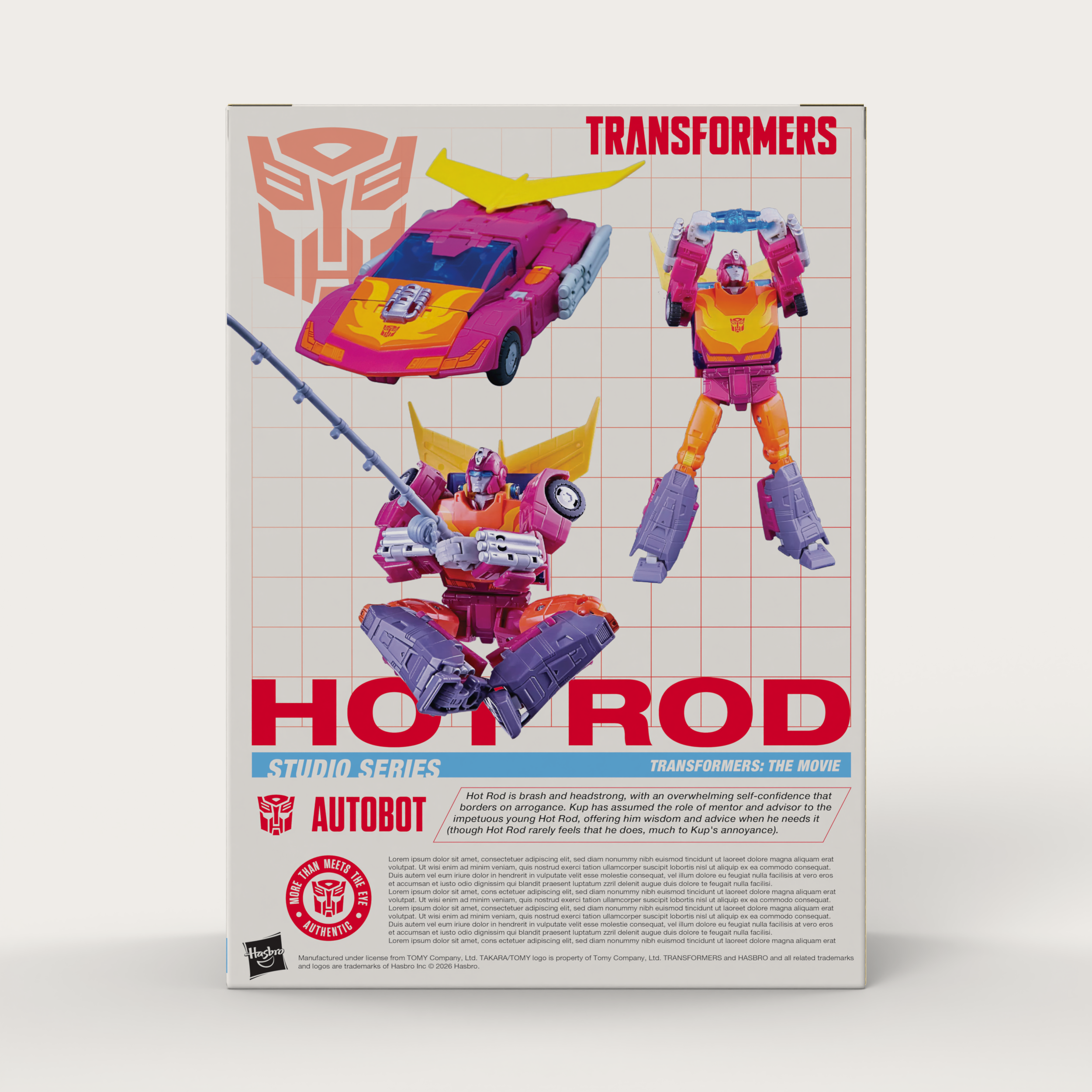
The Autobot counterpart to the Decepticon Voyager, I set this up as a direct comparison to the its counterpart and compare how different name lengths worked.
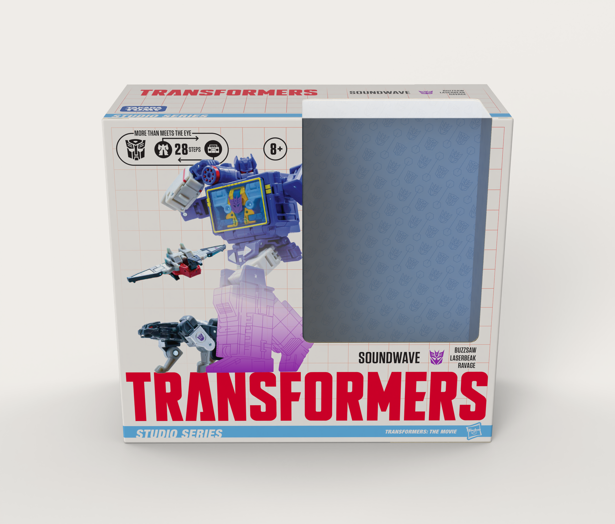
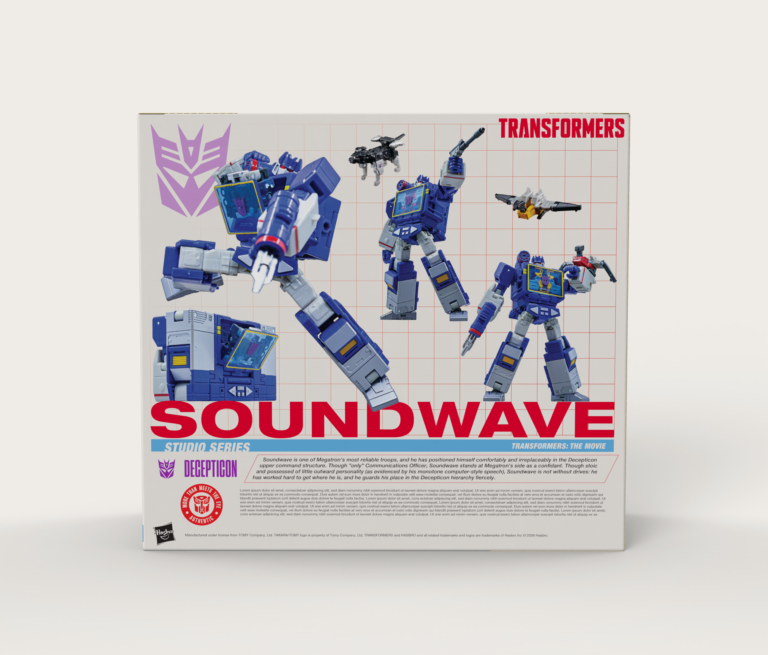
The Leader Class size- the best of the best. Larger figures or ones that contain more accessories. The use of Soundwave was an opportunity to show how multi-packs with multiple characters show names. This design was meant for sitting on shelves and because of the price point necessitated an acetate window.
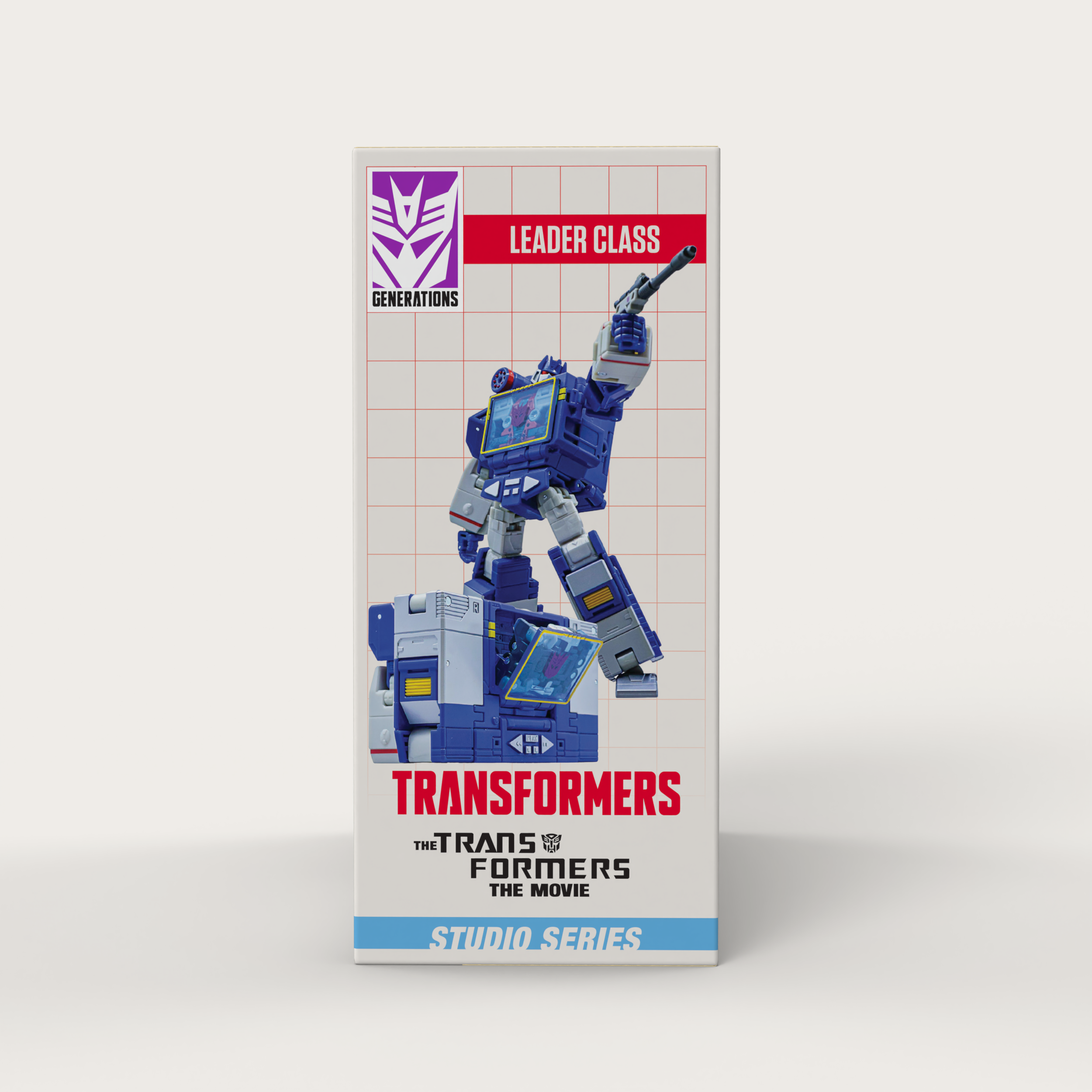
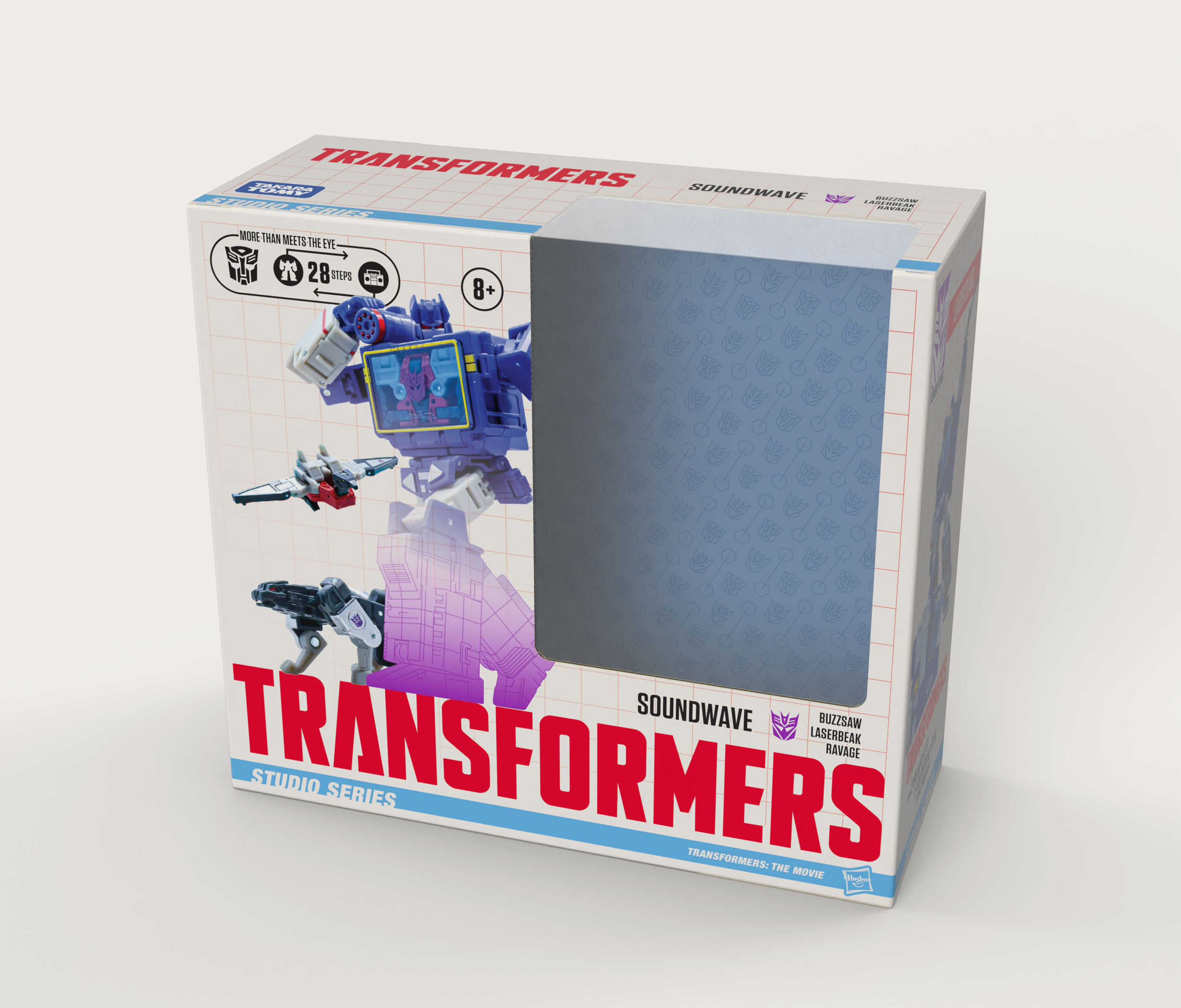
A better view of the top, while showing that this design used an acetate window. The size of this product also meant a hangtag wasn't going to be as feasible, so I removed it to mimic current offerings.
Production
When creating the files for this speculative refresh, production limitations and guidelines were on the forefront of my mind. Specifically finishes, flutes, and bottoms.
Generally these boxes are two and three part packages with an E-Flute or Card main box with an E-Flute insert that the product will be attached to with recyclable ties, with accessories wrapped in tissue paper and fastened to the box with tape.
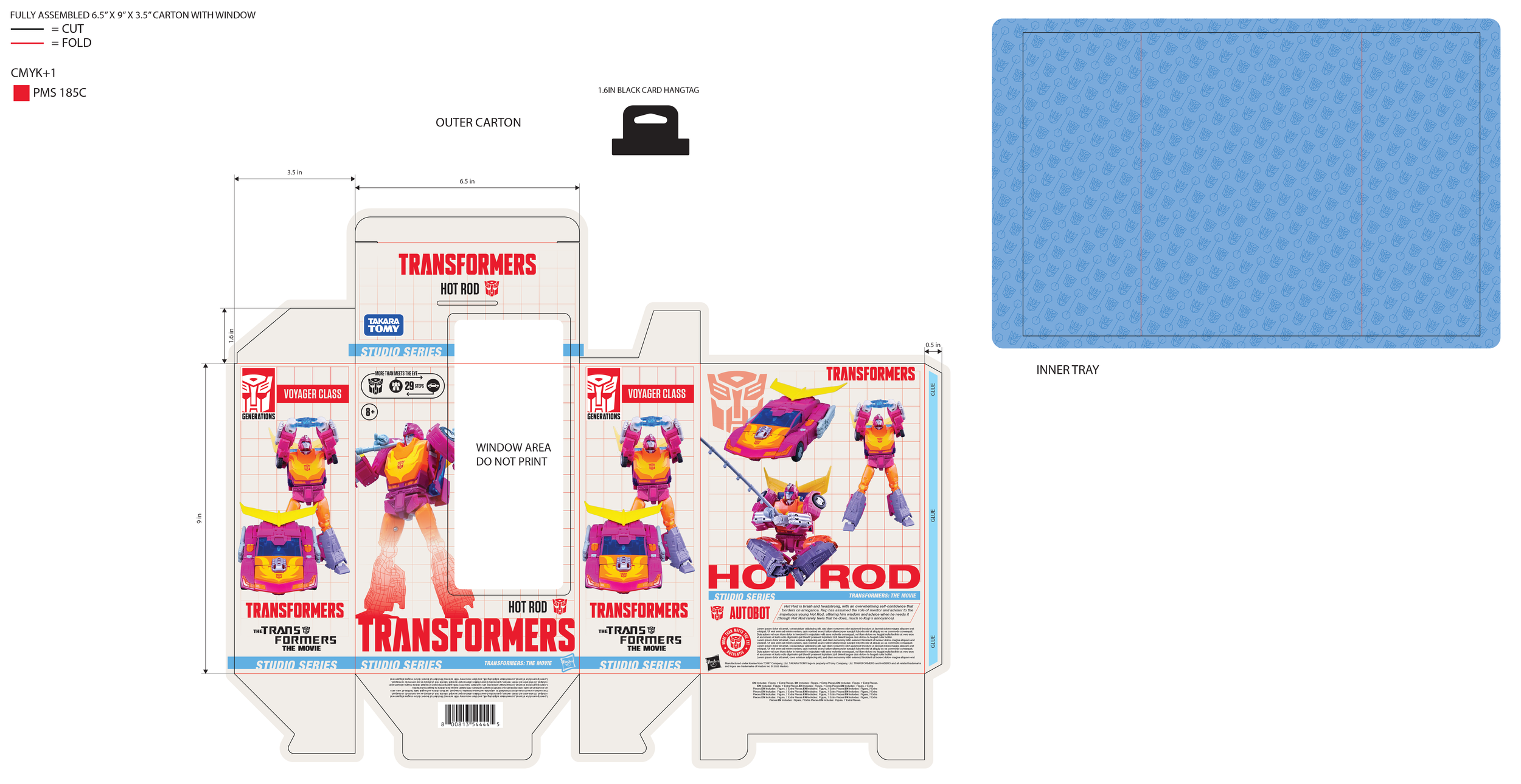
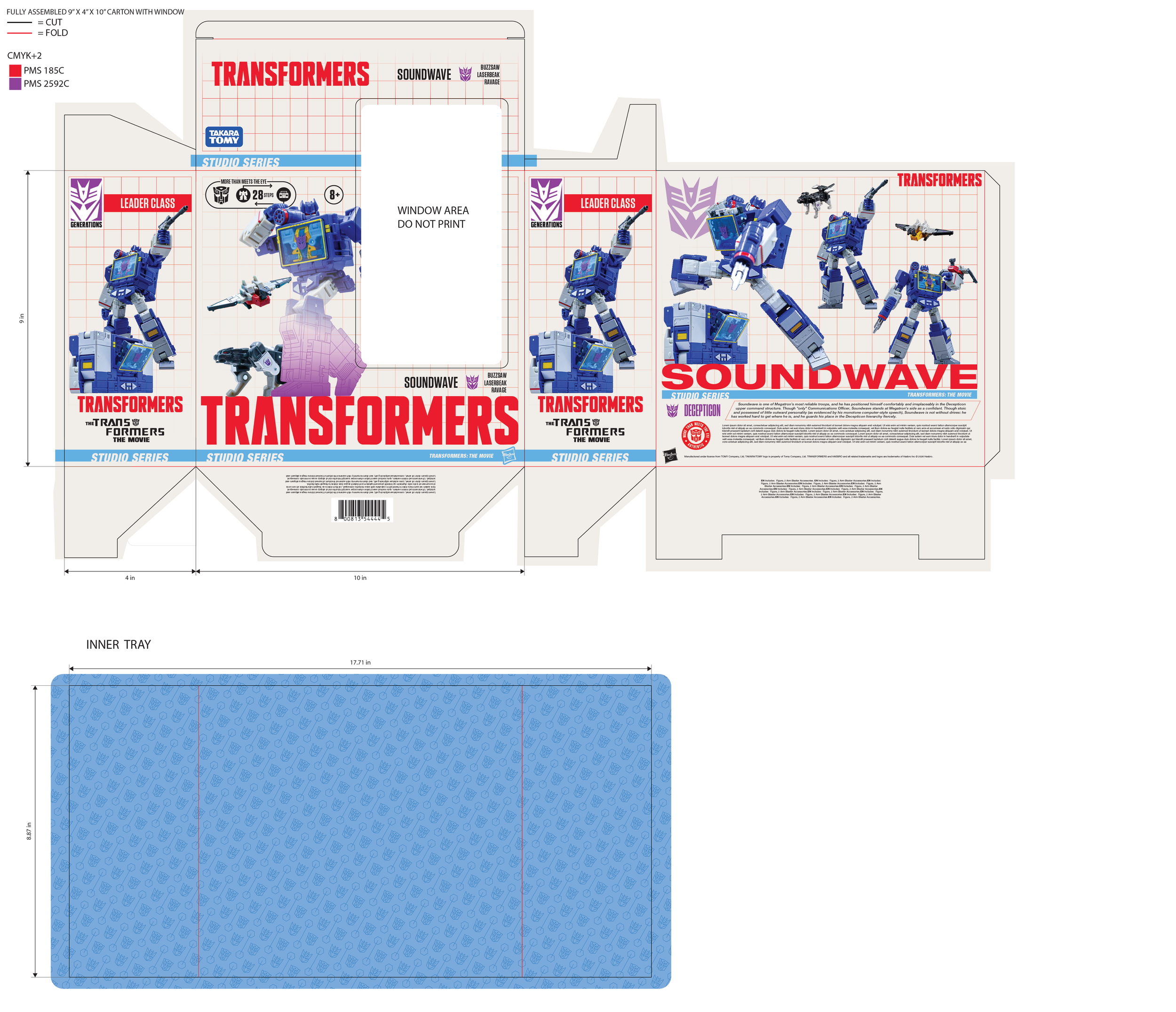
The outer box is CMYK+1 or CMYK+2 depending on alignment (Decepticon Purple uses PMS 2592 C) to ensure bright colors that pop in retail. All except the Core Class use a 1-2-3 Bottom to reduce cost and use of stickers to keep the box closed. It also uses a satin finish for outer box as well as fluted insert.
Below are flatlays showing how boxes were constructed, with special attention paid to the right side closing flap so it wouldn’t clip with the window opening. I also included a higher res version of the tiled pattern I created for the backer card.

A big thank you to @tftoy_pics - his photography is partially what inspired the project, and it was wonderful to get to use these to create something I was proud to present. Some photography used, as well as all of the logos and marks associated with the Transformers brand and Hasbro belong to Hasbro Inc.