

Posters & Layouts
personal work - ongoing
Overview
A general catch all page for personal layout projects that aren’t big enough to have their own dedicated “project” page. Posters, smaller book projects, or booklets fall into this category.
Posters
A catch all section for posters I’ve made starting in the summer of 2025. A gallery with captions noting thought process or the process to make each poster, I wanted to display these separately than illustration because most of them don’t contain illustration of my own, and are more layout and aesthetic based. A lot of fanart, and getting to play with the tools of other IPs in an unofficial manner.
Click into the image to see full size, as gallery doesn’t support full ratio thumbnails.
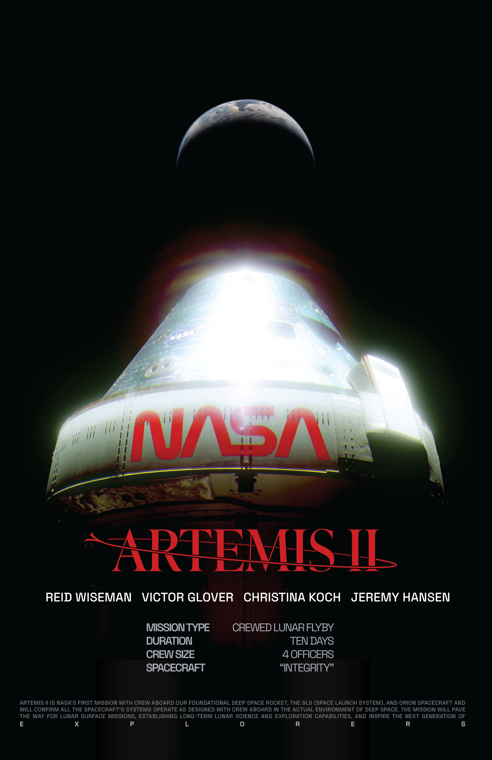
A quick poster done in celebration of the Artemis II mission! I wanted to create a custom mark for the occasion separate from the edited version of Inter that NASA used for the press release, and celebrate the return of the worm logo being used. I edited the "Rise and Shine" photo of the Orion capsule and placed a separate image of earth from the same mission to give it a bit more depth.
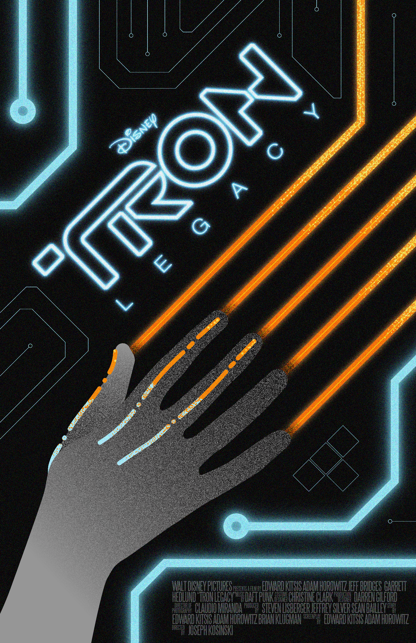
A re-imagined movie poster for one of my favorite titles, Tron Legacy. A lot of inspiration for this came from the pulsing synths on the soundtrack as a contrast to the orchestral swells. All digital with the grime of a grain. The color palette is a nod to the literal software corruption that the titular character went through when becoming Rinzler, prior to the film.

The first poster in a series from the Bungie title Destiny 2, it's the Succession, a sniper rifle from the Deep Stone Crypt Raid. The text I used in this was inspired by the Legacy's Oath armor set, and was the first experimentation. The Braytech Exoscience logos have found a home as accents.
The Forerunner. A weapon released with the Bungie 30th anniversary, it's the M6D Magnum from Halo:Combat Evolved by any other name. The text was inspired by the lore tab, but tailored to make references to the Halo series (the hushed casket, the silent cartographer). The background geometric shape was actually created from a picture I had seen of light passing through a window at an angle. It reminded me of forerunner architecture.

Ergo Sum, the exotic sword, has a lot to pull from in terms of lore and theming. In this case, I chose to use the triple repetition to create a kind of movement, almost akin to it being pulled from a stone (a la Excalibur). The central text for this was inspired by the weapon's "lore" tab. The background text, repeating ways to say silent, were inspired by the flavor text "Silent. Silent. Silent." present when viewing the weapon in game.
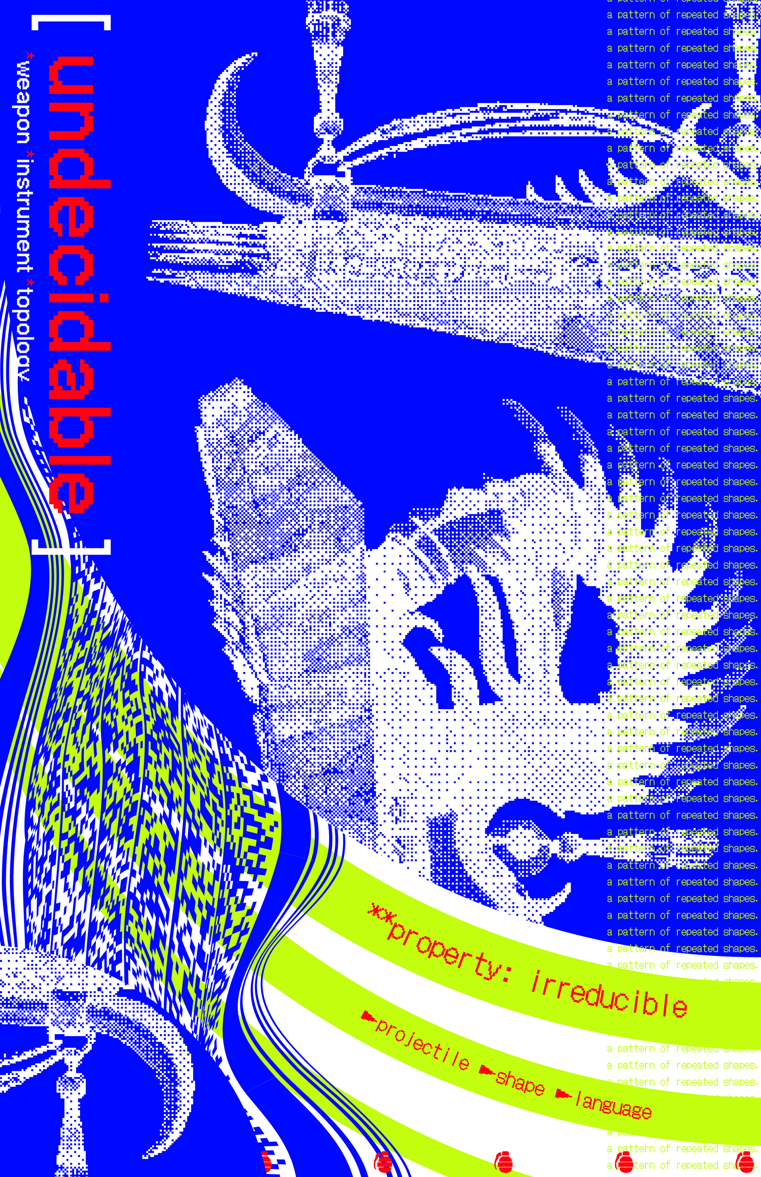
The Tessellation, a quirky fusion rifle that eats grenades and creates elemental explosions, it was launched with The Final Shape expansion and has a lot of interesting shapes I wanted to play with. The inclusion of a tiled and warped PDF417 barcode describing the function of the weapons was something I wanted to use to show the contrast between the organic shapes and more rigid geometrical shapes within the weapon.
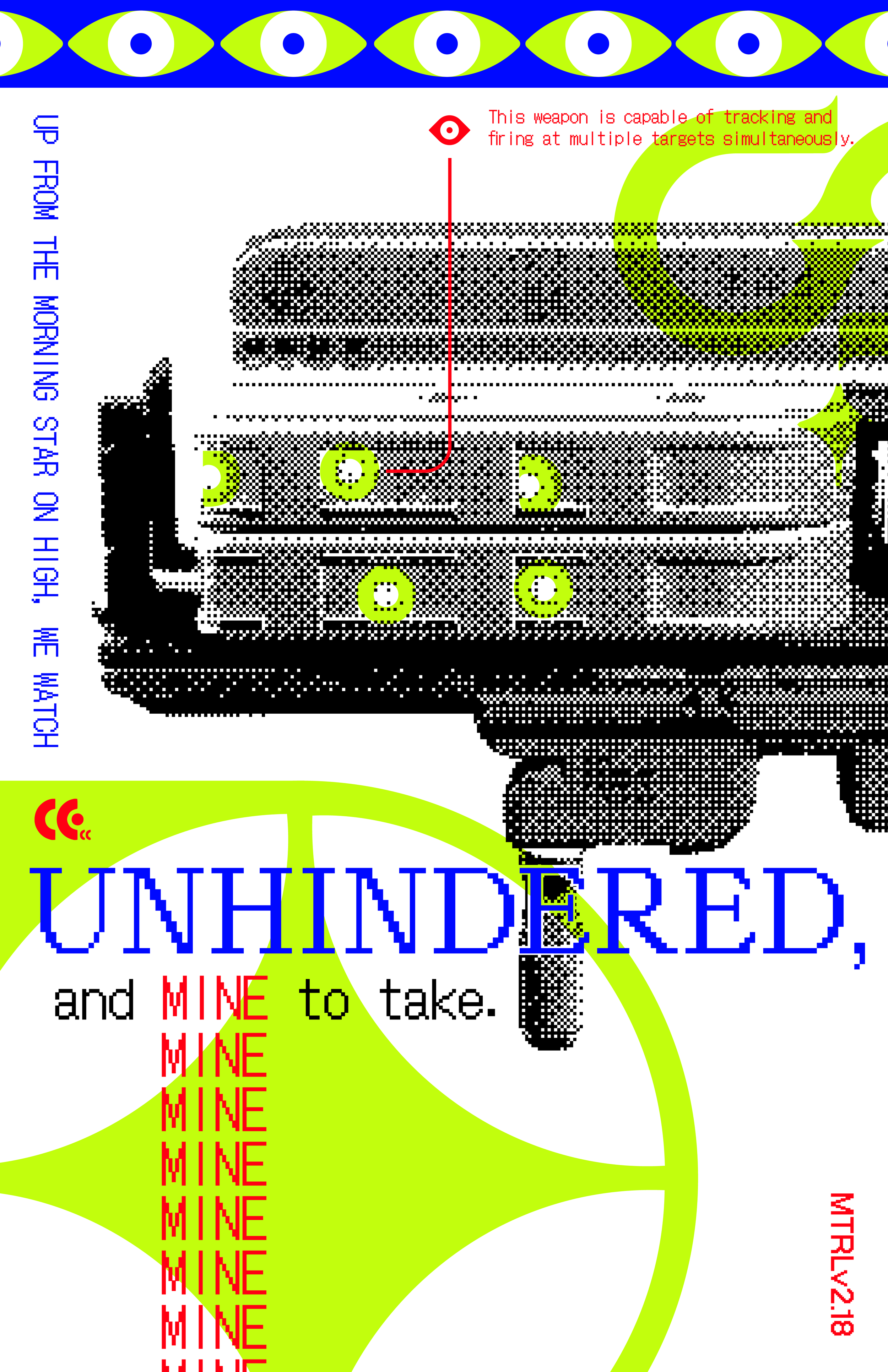
Eyes of Tomorrow, the exotic rocket launcher from the Deep Stone Crypt raid- this was a balancing act in trying to utilize the Braytech branding in a more overt way, while keeping to the theme of the series. The numbers in the bottom right are pulled from the lore log associated with the weapon.
6 Month Planner
A smaller project that was moreso a challenge to create something functional, the goal of this was to create a production ready A5 planner that could be used as replacement refill for the Hobonichi Techo cover.
It utilizes frog illustrations in the front to act as swatches for inks, highlighters, or other writing instruments as a safe space to test before getting to the main body of the planner. The rest of the planner utilizes a 5x5mm grid as a base, with a blank calendar spread every 32 pages to set up monthly dates and habits. Each of the six sections has a specific color, and the page number moves down with each month to improve ease of use when there isn’t a bookmark available to keep place.

The front section with frog illustrations to create swatches. Below are lines to indicate what the swatch above is. The original intention of this being fountain pen ink swatches.

One of the blank calendar spreads, meant to be numbered according to the date, and includes a habit tracker below. The calendar also starts the new color section.

A daily spread, one page per date with fields in the top left and right to indicate the date, day of week, etc.